Role: Lead UX/UI Designer — sole designer
Platform: Connected television and mobile
Scope: Product strategy, user journeys, wireframes, visual direction, high-fidelity UI and pitch development
Deliverable: A pitch-stage product concept for Warner Music Latina
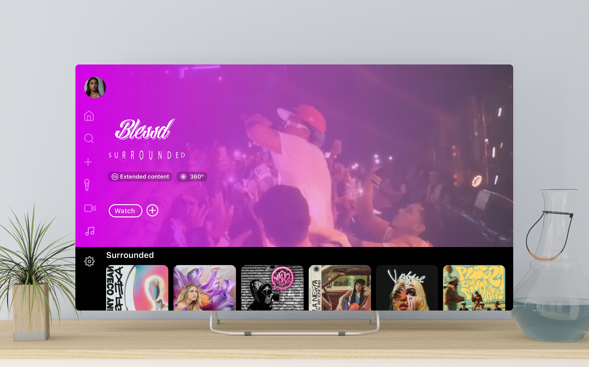
a music experience made to used, not just watched
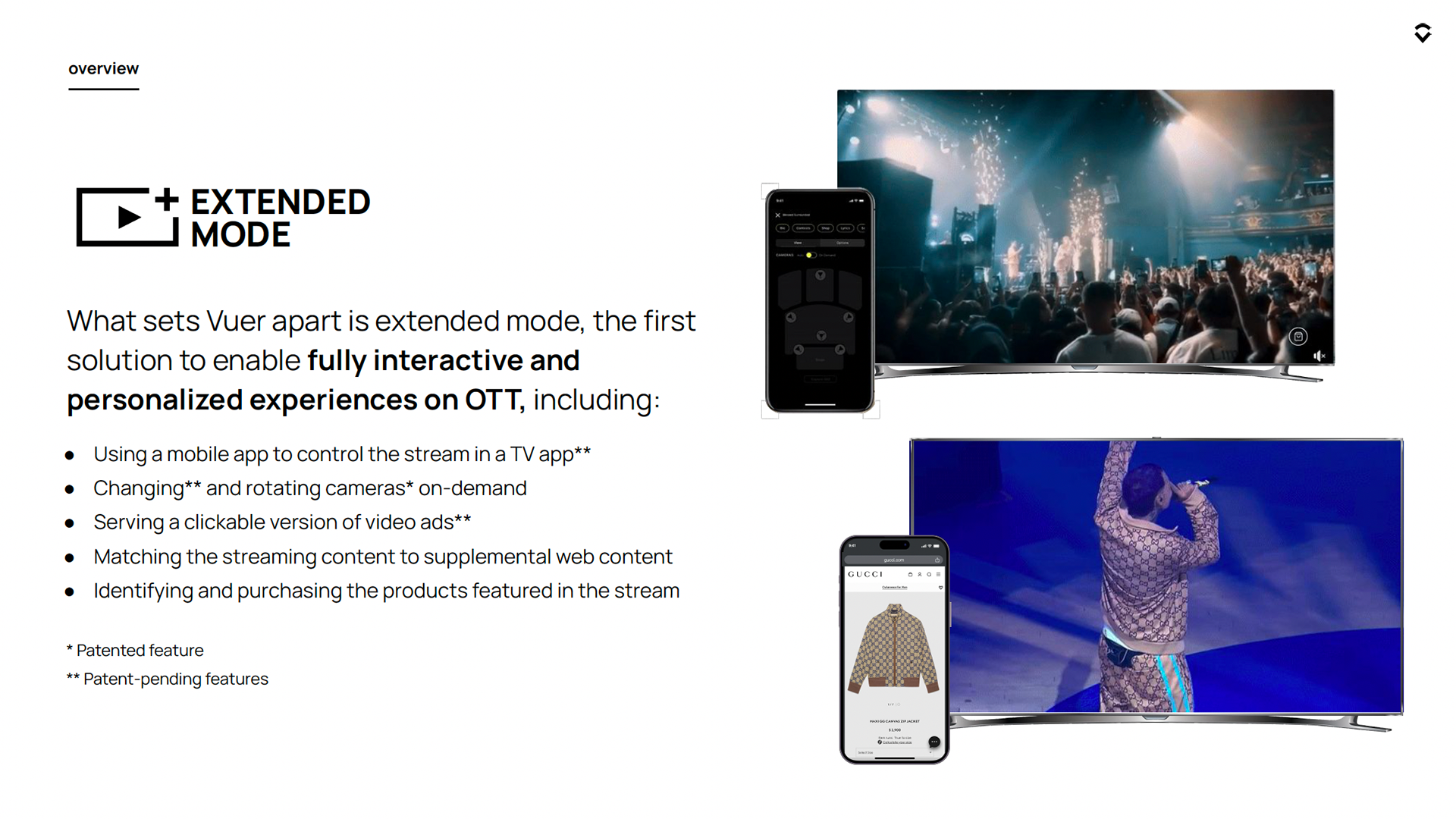
Vuer had the technology to connect what was playing on a television with a person’s phone. What it needed was a clear product idea: something Warner Music Latina could see, understand and imagine people actually using.
As the only designer on the project, I turned that technology and the business pitch into one connected experience across TV and mobile. I defined what belonged on each device, explored how fans could move through the experience and designed the interface used to pitch
The Challenge
There was no reason to build another version of Spotify or YouTube for television. Those platforms already handled discovery and playback well. If this product was going to earn a place in people’s lives, it needed to offer something they could not already get.
The concept had to answer three practical questions:
- Why would an audience choose this experience over an established streaming platform?
- What should happen on the television, and what should move to the phone?
- How could interaction deepen the experience without interrupting the music?

My role
I was the only designer on the project. I worked directly with Vuer’s leadership to understand what the platform could do, what the company wanted to sell and what Warner Music Latina needed to see in order to believe in the idea.
The product was not handed to me as a finished brief waiting for a visual style. I helped give it shape. I organized the experience across two devices, translated technical possibilities into features people could understand and took the idea from wireframes to the final pitch interface.
The Challenge the central product decision
Keep the TV immersive. Put personal actions on the phone.
The biggest product question was not how many features we could add. It was where each action should live. Repeating everything on both devices would have created two interfaces fighting for attention, so I gave each screen a clear job.
The television stayed focused on the shared, cinematic experience: watching, discovering and playing content. The phone handled the personal actions, like choosing a camera, exploring more about an artist or interacting with content without taking over the main screen.
The rule was simple: watch and discover on the TV; control, personalize and act on the phone. That decision made the two devices feel like parts of the same product instead of a TV app with an extra mobile feature attached to it.
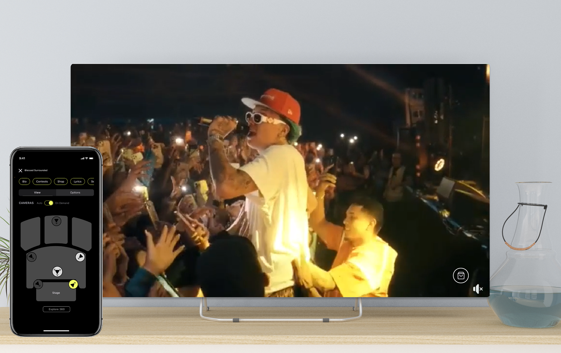
exploring the connected experience
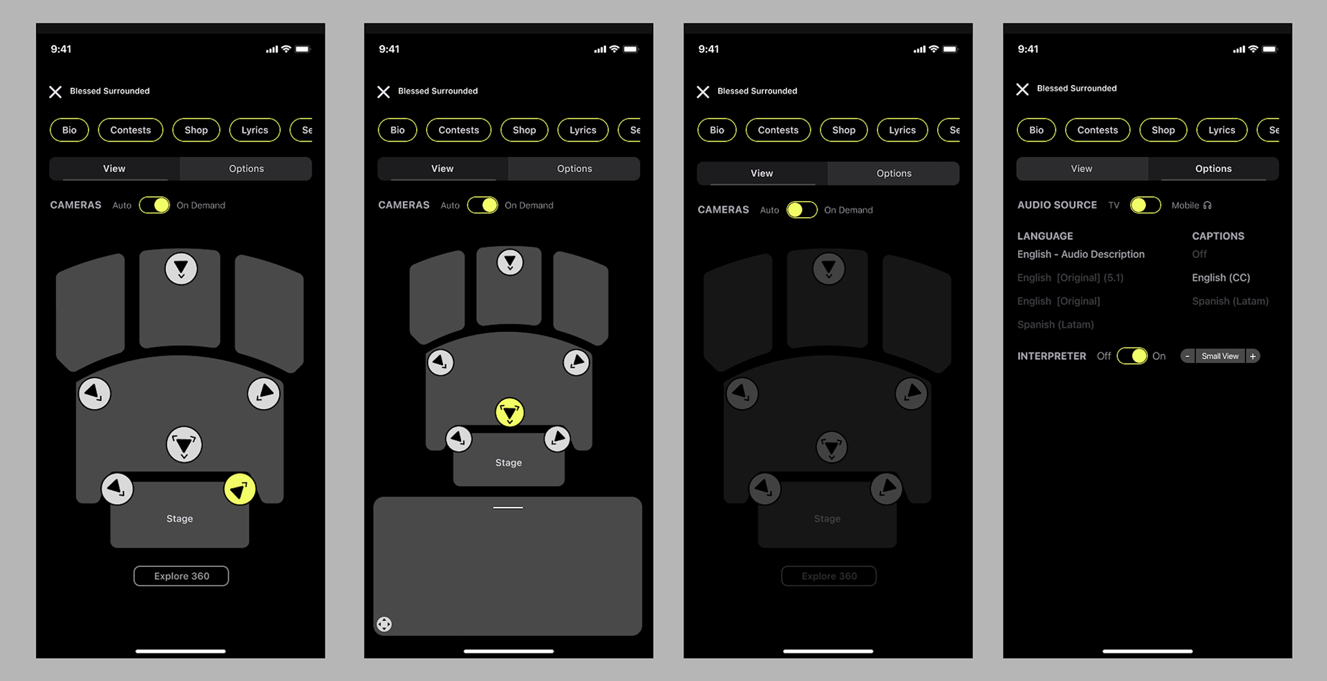
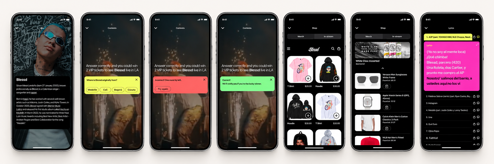
I used the early mobile wireframes to explore how far the connected experience could go. That included alternate camera controls, artist information, trivia, lyrics, merchandise and other ways for fans to interact with what they were watching.
Not every idea needed to make it into the final pitch. The point was to understand the range, decide what belonged on the phone and give the team something concrete to react to instead of discussing the technology in the abstract.
the performance always came first
There was a real temptation to show everything the platform could do at once. But if every feature demanded attention, the music would disappear underneath the product demo. I chose to keep the performance dominant and make the extra layers available only when someone wanted them.
The home screen helped people get to recent content, favorite artists and featured releases quickly. Once inside a performance, overlays and content rails kept more content within reach without pulling the viewer into a completely different part of the app