Role: UX/UI Designer
Scope: Equipment details, support information, navigation and machine-status presentation
Collaboration: Product, engineering, research and support
Scope: Equipment details, support information, navigation and machine-status presentation
Collaboration: Product, engineering, research and support
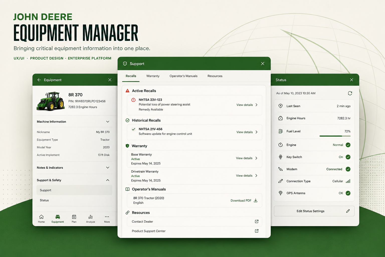
UI shown is a conceptual recreation for portfolio purposes. Actual product screens and proprietary materials have been omitted for confidentiality.
THE PROBLEM
The information was there. Finding it took too much work.
John Deere’s Equipment Manager gives customers visibility into the machines they own and operate. But information like warranties, recalls, operator manuals and machine status was fragmented across the experience.
The challenge was to bring that information within reach while working inside an already dense interface. Adding more content would only help if people could understand where to find it and what belonged together.
My role
I worked with product, engineering, research and support to translate complex requirements into the desktop experience. My work focused on how equipment information was organized, how users moved through it and how much each panel needed to show.
Customer and dealer validation helped the team assess whether the direction supported the way people looked for information about their machines.
The central decision
Make the machine the starting point.
I organized support information around the equipment it belonged to. Someone checking a machine should be able to reach its warranty, recalls and manuals from its details, with fewer reasons to leave that context.
That principle connected the changes across the experience: where information appeared, how tabs were organized and how limited panel space was used.
Four connected design decisions
1. Bring support information into equipment details
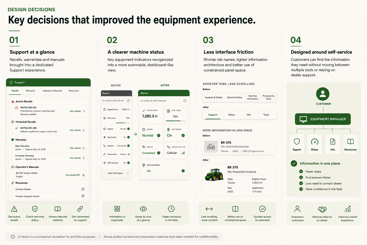
We surfaced warranties, recalls and manuals within the equipment details. The aim was to connect each support need to the relevant machine and reduce the navigation required to find it.
2. Give machine status a clearer hierarchy
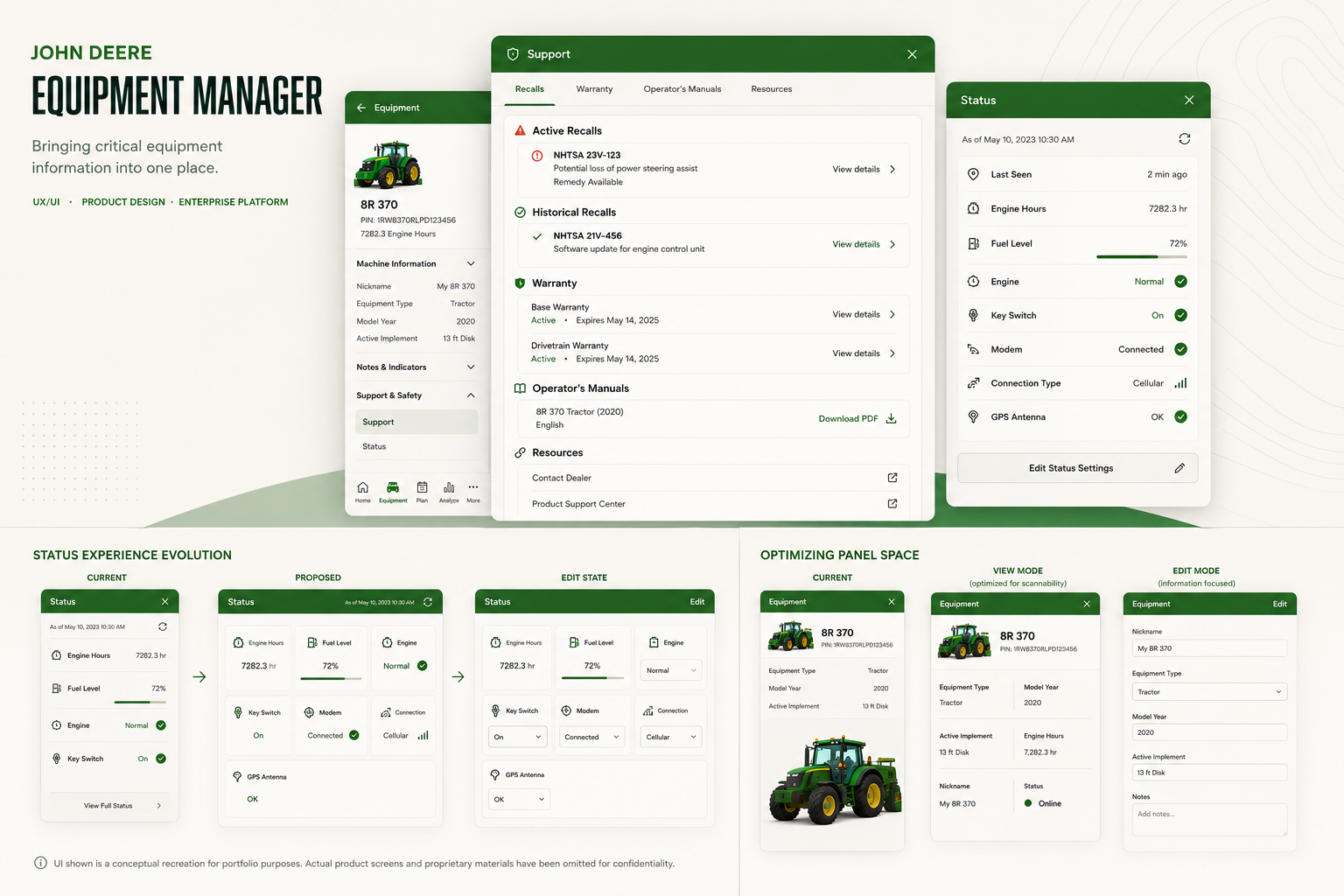
Machine-status information competed for space in a dense interface. We reorganized its presentation to make the available information easier to scan, rather than treating every detail as equally prominent.
3. Simplify the tab structure
We simplified the tabs to give the content a clearer organization. The goal was to help users understand where information belonged before opening several sections to find it.
4. Make limited panel space work harder
We adjusted the layout within the available panels to accommodate support and status information. This meant considering content, hierarchy and navigation together, so each addition had a clear place in the existing interface.
The outcome
A more connected place to manage equipment.
Customer and dealer feedback indicated that the direction brought Equipment Manager closer to a one-stop destination for equipment information. That supported the goal of helping users find answers independently; it did not establish a measured reduction in support requests.
The team delivered the contracted development phase in seven months against an original twelve-month plan. My contribution was the UX/UI work supporting that delivery, developed in collaboration with the wider team.